VIX: ‘Cluster, Pop, Revert’ Strikes Again
With the second full trading week of September getting underway, a quick glance at the some of the most closely followed market gauges provides strong insight into the current mood of the markets.
And compared to the last several weeks of trading, it might be best characterized as a “mellow mood.”
The VIX, after all, is back trading below its lifetime average of around 19. As of this writing, its most recent closing price was about 15.
With the VIX slumping, it shouldn’t come as much of a surprise to hear that the S&P 500 has rebounded and is trading back near its all-time highs. Despite the extensive volatility observed in August, the S&P 500 is currently only about 50 points below its all-time mark of 3,025.86 (set on July 26, 2019).
For now, it seems that the old trading axiom, “you can’t keep a good market down,” is holding water.
What’s most interesting, however, is that the VIX appears to be maintaining a pattern previously identified by the tastytrade financial network back in spring of this year.
As a brief reminder, the VIX is derived from price inputs of S&P 500 index options, and therefore represents the market’s expectation for short-term (30-day) volatility. Because of the way it is calculated, the VIX tends to exhibit mean-reverting behavior – much like implied volatility in the instruments that underlie its value.
Early this past spring, the tastytrade research team noticed a pattern developing in the VIX, and decided to delve into a deeper analysis of its historical behavior. The results of this research were presented on a previous installment of Market Measures, and the findings are undoubtedly worth a closer look.
After an extensive review of recent data in the VIX, researchers at tastytrade noticed that the popular volatility metric appeared to be “clustering, popping, and reverting” according to a discernible pattern. Specifically, the VIX has shown a tendency to cluster at compressed levels, before popping aggressively to the upside, and then slowly reverting back toward (and below) its historical mean.
The chart below taken from Market Measures illustrates this “cluster, pop, revert” pattern using VIX trading data from 2018-2019:
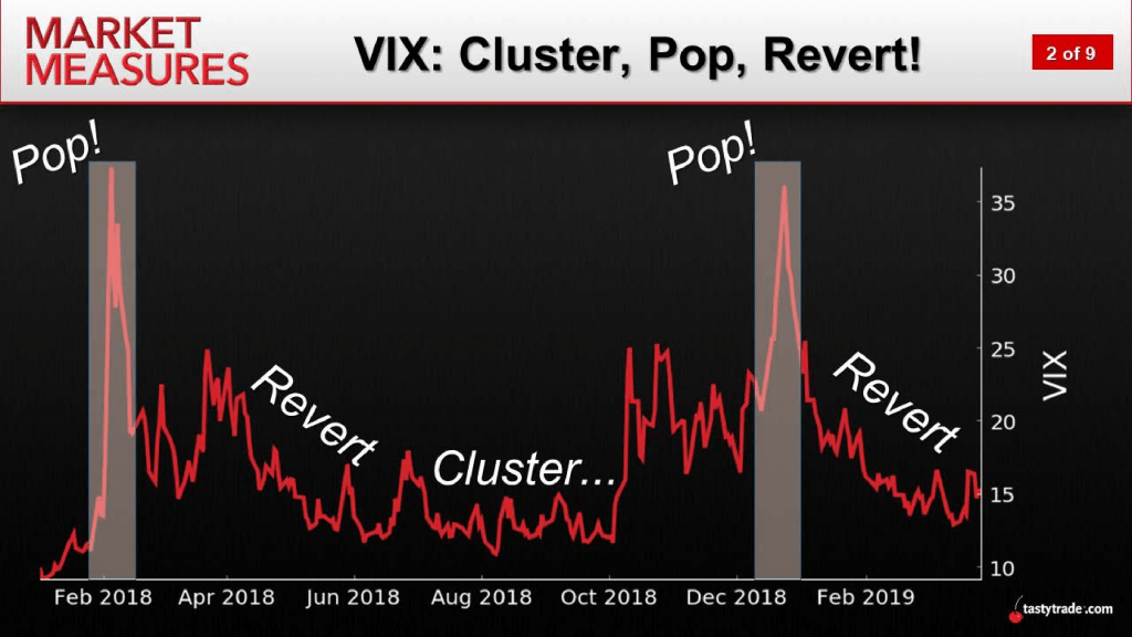
Adding context to the above data, one can see in the chart that the 2018 trading year started in roller-coaster fashion, which is reflected in the heightened levels in VIX during February of 2018. The chart then outlines how the VIX declined steadily through the next couple of months before clustering at relatively low levels during the summer.
Next, in fall of 2018, the VIX popped once again—arguably due to concerns over global economic growth related to the US-China trade war. Regardless of the exact reason, fear once again subsided, and the VIX reverted back toward its mean (and below) during the first quarter of 2019.
Amazingly, this pattern appears to have once again repeated itself.
After “clustering” at compressed levels in June and July, the VIX once again popped in August, and has since “reverted.” And while “reversion” behavior is to be expected in this underlying, the way that every VIX pop has gotten snuffed out so quickly in recent years is one unique characteristic of this pattern.
Importantly, there was another dimension to the tastytrade research that provided arguably even more valuable insight. The purpose of the next stage of the analysis was to evaluate the historical success rate of a trading strategy intended to gradually layer in short premium sales as the VIX entered its “pop” phase.
As is usually the case in tastytrade market studies, the research team set up an “experimental portfolio” and a “control portfolio” to try and better evaluate the relative performance of such an approach.
In this study, the experimental portfolio was short 20-delta strangles deployed in SPY after 5%, 10%, and 20% pops in the VIX. For the purposes of comparison, the control group involved simply selling strangles when there was no pop in VIX.
The findings from the four backtests included in the study are summarized in the graphic below, and help illustrate the relative performance of each approach:
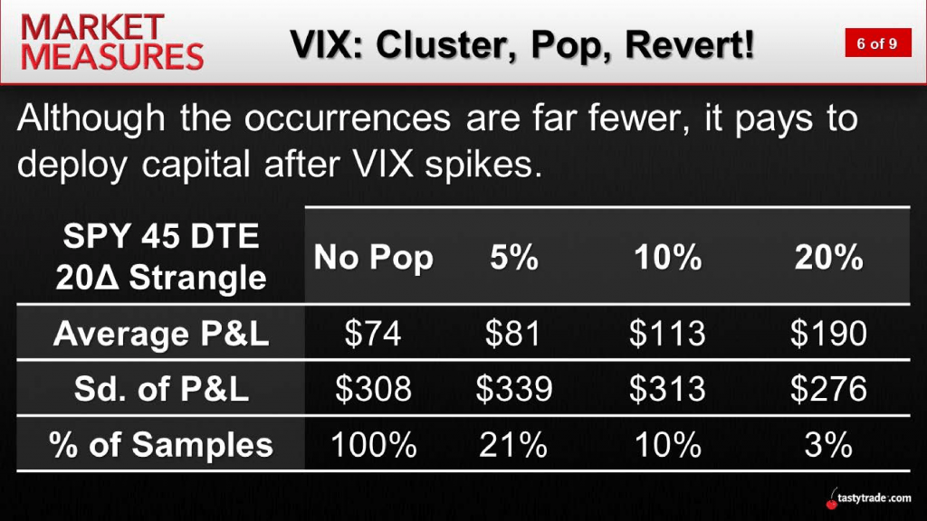
What sticks out from the above data is of course that the highest average P/L was associated with a 20% pop in VIX. What also sticks out is the fact that the lowest average P/L was associated with “no pop.”
However, what might be most striking about the analysis is the revelation that the 20% pop in VIX also produced the lowest standard deviation in P/L—meaning that the risk dynamic was actually the smallest when VIX had popped the most, as compared to the other three approaches.
While each and every trader will apply the learnings from this study according to their own strategic approach and risk profile, the findings do appear to support the notion of trading small in low volatility environments, so that capital is available when the VIX enters its “pop” phase.
While this research in no way seeks to forecast or predict future movement in the VIX (or any other underlying), it does seek to highlight the pattern observed in recent VIX behavior, and provide more context around how short premium strategies have performed when the VIX is rising.
To learn more, traders are encouraged to review the complete episode of Market Measures focusing on the “cluster, pop, revert” pattern when scheduling allows.
Additional information is also available in the tastytrade LEARN CENTER.
Sage Anderson is a pseudonym. The contributor has an extensive background in trading equity derivatives and managing volatility-based portfolios as a former prop trading firm employee. The contributor is not an employee of luckbox, tastytrade or any affiliated companies. Readers can direct questions about any of the topics covered in this blog post, or any other trading-related subject, to support@luckboxmagazine.com.