Volatility Contraction Part 2: The VIX and Market Corrections
The S&P 500 was down about 34% on the year at its worst moment (so far) in 2020. After a strong rally from that trough, the S&P 500 is now down only about 15%.
Given how harrowing the Corona Crisis has seemed at times, it’s maybe somewhat surprising to look up and see that the S&P 500 has weathered the storm in such good condition, especially when one considers the current state of the U.S. economy—or lack of one.
Based on unemployment claims during the last three weeks, it’s now estimated that the overall unemployment rate in the United States has jumped from recent lows in 2019 (less than 4%) to somewhere in the neighborhood of 10% to 15%. And it could rise even further, based on some projections.
One can only assume that U.S. investors are assuming the unemployment rate will quickly shrink back below 5% at some point in the near future, and that the current lockdown of the country’s economy will be very temporary. Otherwise, it seems difficult to think that the S&P 500 could stay so high (relatively) given such extreme readings on joblessness.
As one might expect, the recent rally in the S&P 500 has also been accompanied by a sharp pullback in the VIX, the latter gauge which reached its all-time closing high amidst “peak fear” in the financial markets on March 16.
The VIX and broad-based stock market indices like the S&P 500 share a well-known, strong, inverse historical correlation. That generally means when the indices go down, the VIX goes up, and vice versa, as shown below:
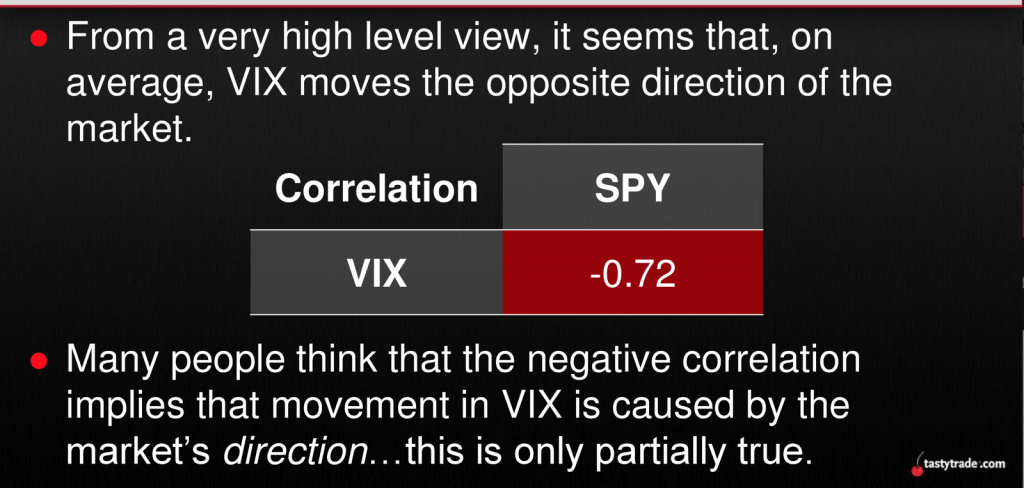
The VIX reports on levels of implied volatility in options of the S&P 500, which means that as option premiums go up, the VIX goes higher. Option prices usually go up when fear enters the market, because as the speed of the market picks up, ss do the expected ranges of movement in the S&P 500 (and many other underlyings, too).
As covered recently by luckbox, implied volatility is a metric in the world of finance that has consistently exhibited “mean-reverting” behavior.
In short, that means elevated levels of implied volatility tend to fall back toward their long-term mean, and that low levels of implied volatility tend to rise toward their long-term mean.
Because the VIX reports on the implied volatility of options in the S&P 500, one would therefore expect to see the VIX exhibit mean-reverting behavior—as it most assuredly has since its inception in the early 1990s.
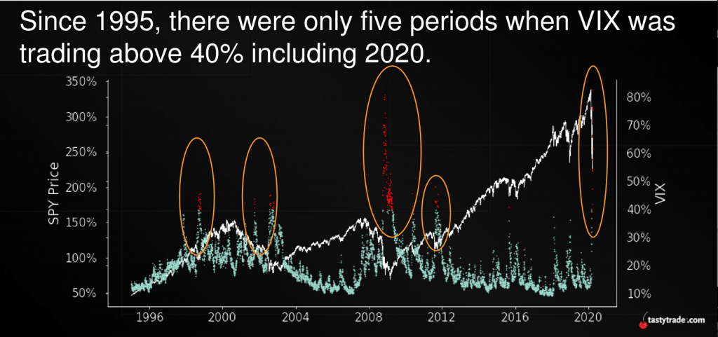
The mean-reverting nature of the VIX, including during the current Corona Crisis, is clearly illustrated in the chart below:
While the above chart provides important context on what’s transpired since the coronavirus started raging on U.S. soil, it’s helpful to widen the lens further and examine how previous contractions in the VIX have played out during other previous corrections.
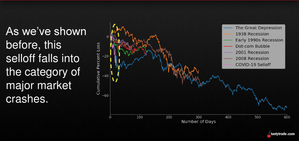
The two graphics below illustrate how the severity of the coronavirus pullback (at its worst point) qualifies the current correction as a major market crash, and one of the biggest corrections observed since the VIX went live in 1993:
Considering the similarity of the current correction with previous crises, one might reasonably wonder how the VIX behaved as it reverted back toward its mean during those past occurrences.
Unfortunately, a good number of severe market crashes (like the Great Depression) occurred before the VIX was developed. In that regard, an analysis of VIX contractions during severe corrections is limited only to those listed in the second slide above.
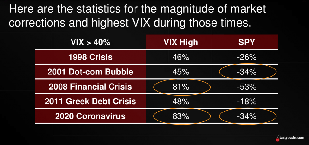
As such, researchers at tastytrade decided to analyze those five corrections and highlight important VIX data which illustrates how the VIX behaved as it contracted, or reverted toward its historical mean. The VIX is currently trading just under 40, and its historical mean is approximately 19.
The slide below summarizes this comprehensive analysis on previous VIX contractions, and breaks down the data into separate 20% contractions by the average number of trading days needed for each 20% move.
For example, as one can see in the last row of the table below, it has historically taken on average only 4 trading days for the VIX to drop from 70 to 56 (a 20% drop):
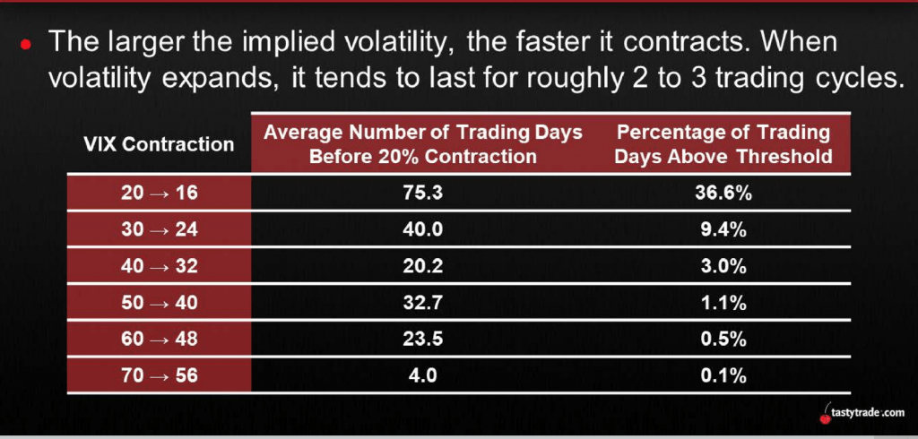
The chart above reveals a clear trend in VIX behavior when it has previously reverted toward its mean. As the VIX has historically trended downward, the average number of trading days needed for the next 20% decline has tended to increase.
So while a contraction in the VIX from 70 to 56 only took on average four trading days, a contraction from 20 to 16 in the VIX has taken on average 75 trading days.
Adding further perspective, the next slide below shows just how rare it is for the VIX to trade above 40. Since 1995, the VIX has traded above 40 only about 4.6% of the time.
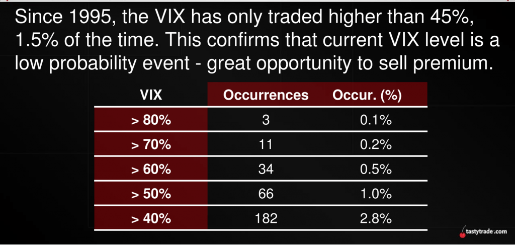
Interestingly, the VIX closed below 40 on April 14 for the first time since March 5.
That’s not to imply the VIX couldn’t easily spike above 40 again at some point in the near future. During the last major financial crisis in 2008-2009, the VIX certainly didn’t move straight down.
As one can see in the price chart below, the VIX staged multiple rallies and pullbacks during 2008-2009, although the overall shape of the trend was downward sloping:
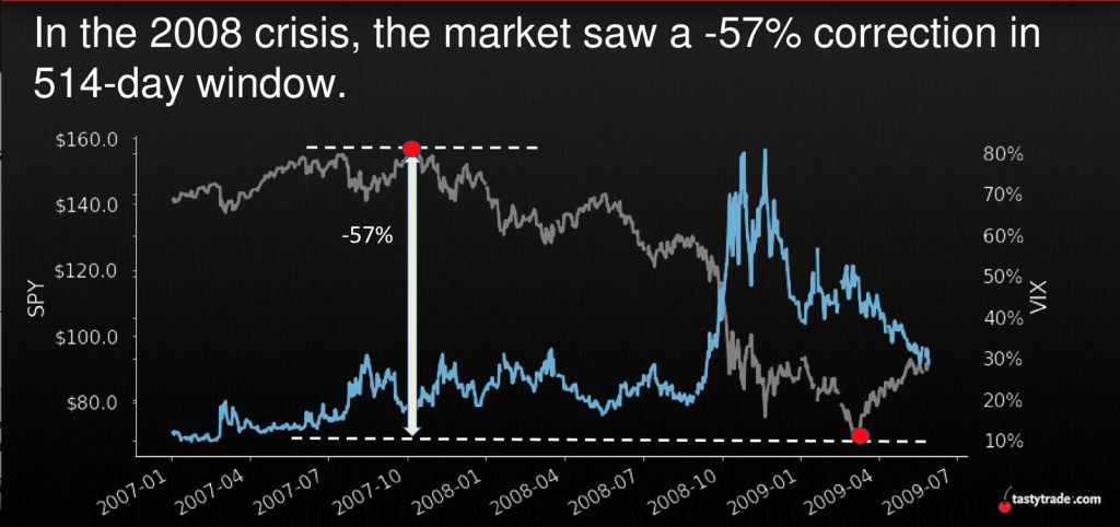
It should also be noted that during the Great Recession, the VIX peaked (closing high of 80.86) well before the S&P 500 bottomed. During that crisis, the peak in VIX occurred on Nov. 20, 2008, while the bottom in the S&P 500 wasn’t observed until March 6, 2009.
For additional information and context on historical contractions in market volatility, readers may want to review the following episodes aired recently on the tastytrade financial network:
- Market Measures: Rate of IV Contraction
- Market Measures: 2008 vs. 2020
- Tasty Extras: VIX at 40 Percent
- Market Measures: The Silent Selloff
Click here to read “Volatility Contraction Part 1: Mean Reversion.”
Sage Anderson is a pseudonym. The contributor has an extensive background in trading equity derivatives and managing volatility-based portfolios as a former prop trading firm employee. The contributor is not an employee of Luckbox, tastytrade or any affiliated companies. Readers can direct questions about topics covered in this blog post, or any other trading-related subject, to support@luckboxmagazine.com.