Forecasting Price Patterns
Every culture develops its own brand of futurism. From time immemorial, people have spun tales of clairvoyance, created magical totems like crystal balls and paid homage to legendary prognosticators like Nostradamus.
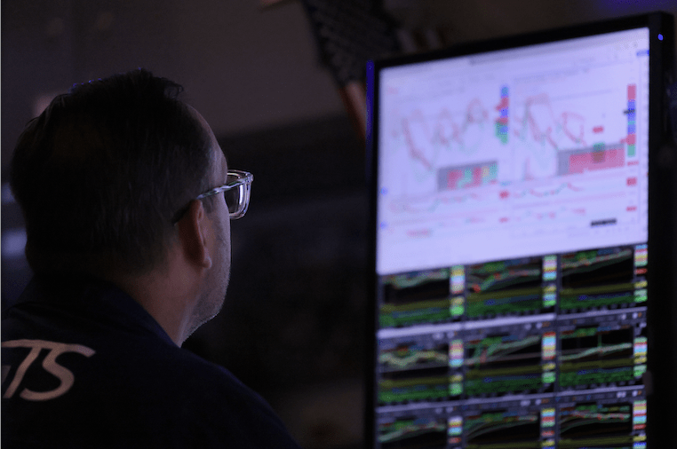
That hunger to foretell events carries over into the world of financial instruments and trading. Investors long to predict prices with better than 50% accuracy. For a technical analyst, foreseeing price paths involves looking for patterns with high-probability outcomes, or using price analogs, technical indicator crossovers or other such events which, based on past behavior, suggest what’s going to happen next.
These methods are subject to interpretation and subjectivity. For the sake of experiment, let’s instead use historical price data and seasonal trends to project an idealized and hypothetical path forward for a given security. In other words, raw price data from past years will be normalized on a week-by-week basis to extrapolate the future seasonal tendencies of a security. The key will be to determine which securities are candidates for an effective price projection, and which ones aren’t.
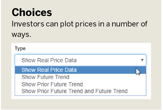
Investors can plot prices in a number of ways. The “Show Future Trend,” option in “Choices,” below, for example, projects a hypothetical path two years into the future. An even more interesting approach is to “dial back” time and see what would have been predicted in the past and compare it to what actually happened. That way, investors can get a decent idea of how accurate a past prediction was and, thus, what the likelihood of making good predictions would be now.
Failed predictions
Most of the time, the past seasonality and overall direction of a security will not be useful for predicting what’s ahead. A couple of examples illustrate this fact.
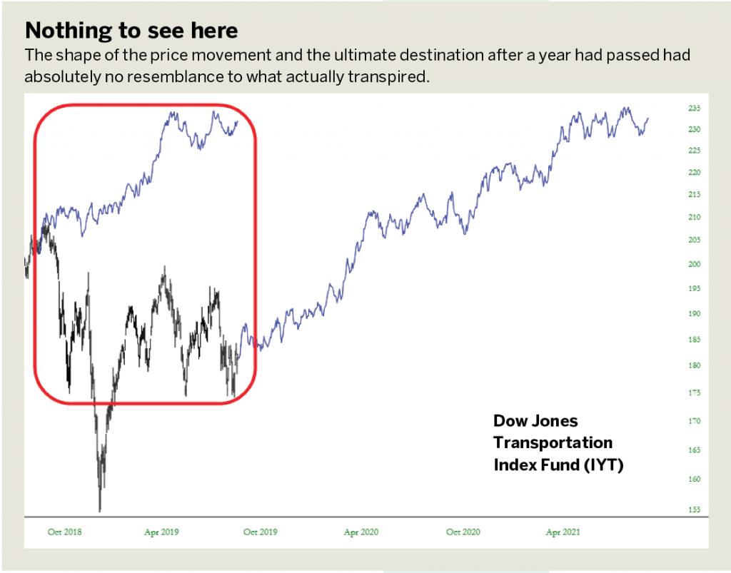
Take a look at the blue line (general area in the red rectangle) in “Nothing to see here,” below. It shows what the system would have predicted a year prior to the chart. It’s plain to see that it wasn’t even close. The shape of the price movement and the ultimate destination after a year had passed had absolutely no resemblance to what actually transpired. We can safely assume that, with this method at least, we cannot have any insight into what’s coming next with IYT. (This is what the blue line on the right side of the chart shows.)
In a similar situation, the SPDR® S&P® Oil & Gas Exploration & Production ETF (XOP) was predicted to continue its strong run (the anticipated path surrounded by the red rectangle in the chart, “Bad prediction,” below).
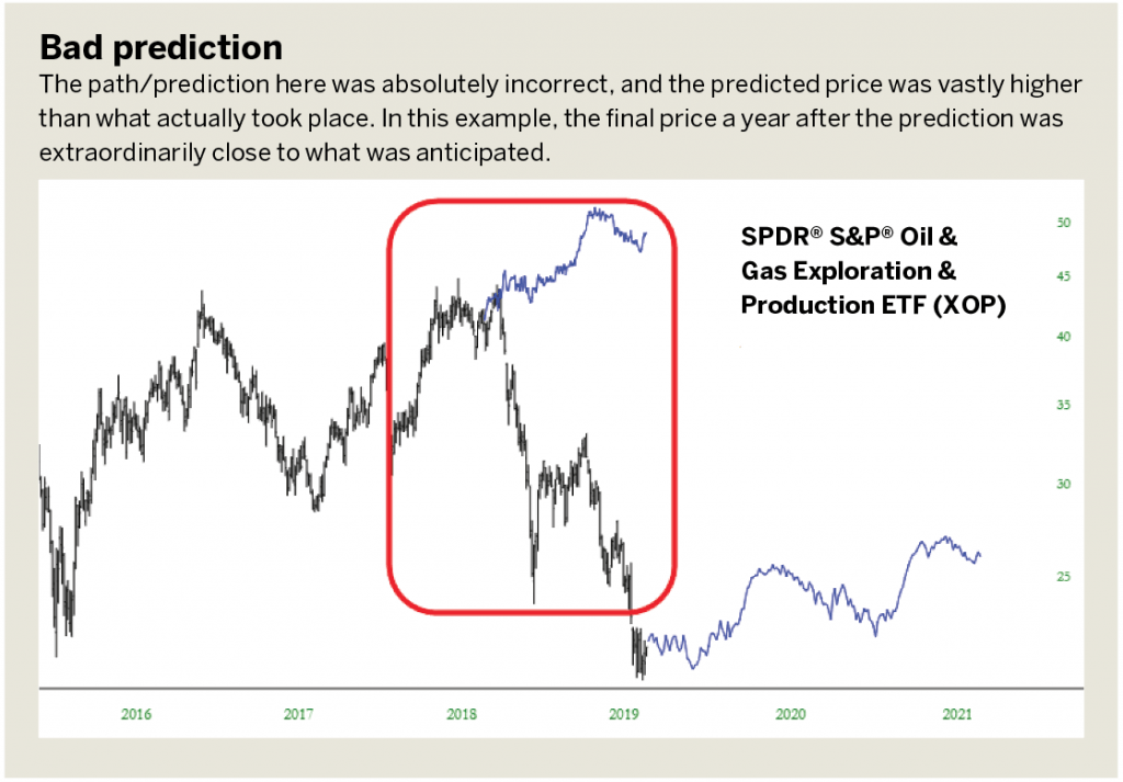
As with IYT, the path was absolutely incorrect, and the predicted price was vastly higher than what actually took place. Indeed, most stocks and funds put through a similar analysis would yield poor results as well.
But don’t discard the method because of a couple of failures. Instances occur when, for whatever reason, securities tend to become more predictable based on past price movements, and thus can create trading opportunities with intriguing probabilities.
Making the (failing) grade
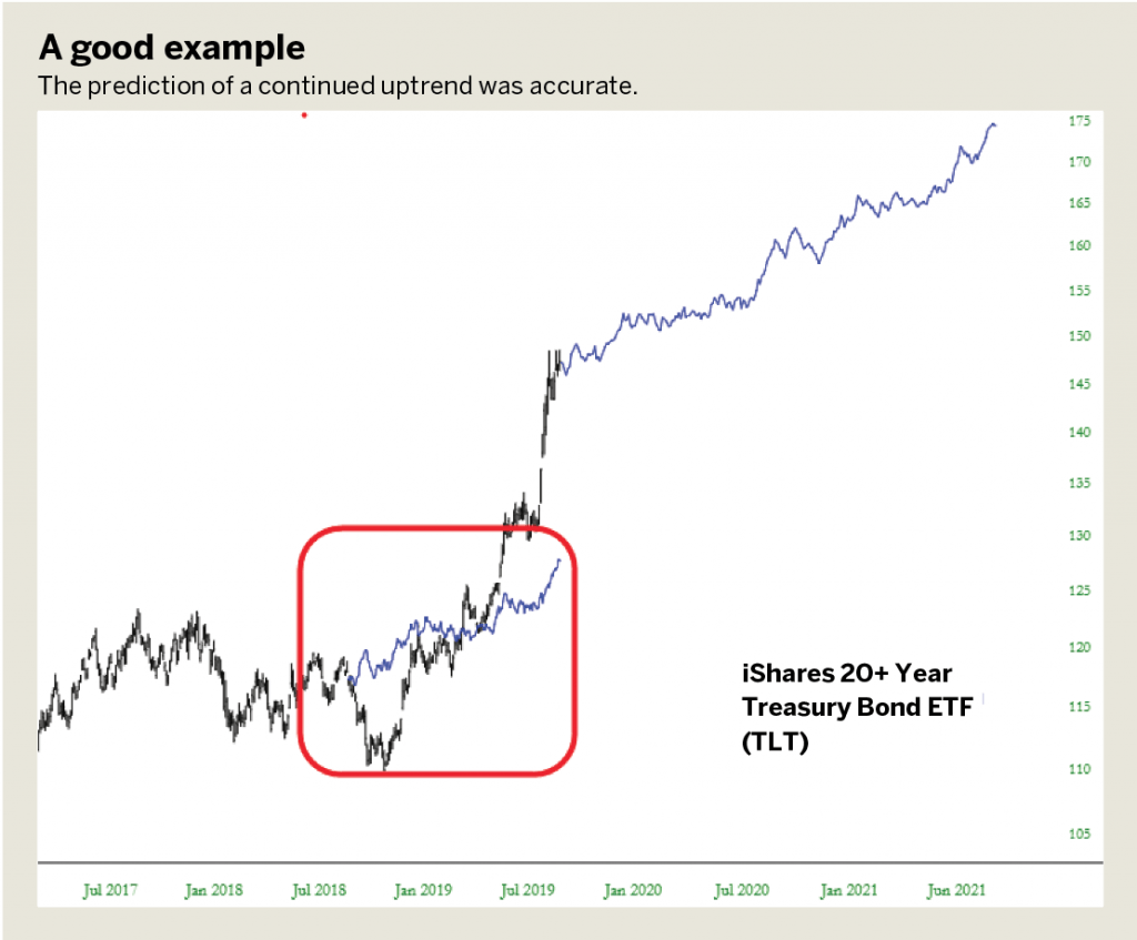
If the two previous examples merited a failing “F” grade, the iShares 20+ Year Treasury Bond ETF (TLT) is close to a C+, or perhaps even a B-. The prediction of a continued uptrend was accurate, as shown in “A good example,” below. The shortcoming to this prediction, however, is that the anticipated price movement was much more modest than what actually transpired. Admittedly, hardly anyone foresaw the astonishing surge in price that bonds enjoyed during this portion of the chart, but at least this simple algorithm pointed in the right direction.
An even better result occurred with the Real Estate Exchange-Traded Fund (IYR). Examine the area enveloped by the red rectangle in “Better result,” below. First, the directional movements over the course of the year were predicted with relative accuracy. It didn’t capture every wiggle of the chart but, broadly speaking, it got the movement right. Far more important, the final price a year after the prediction was extraordinarily close to what was anticipated.
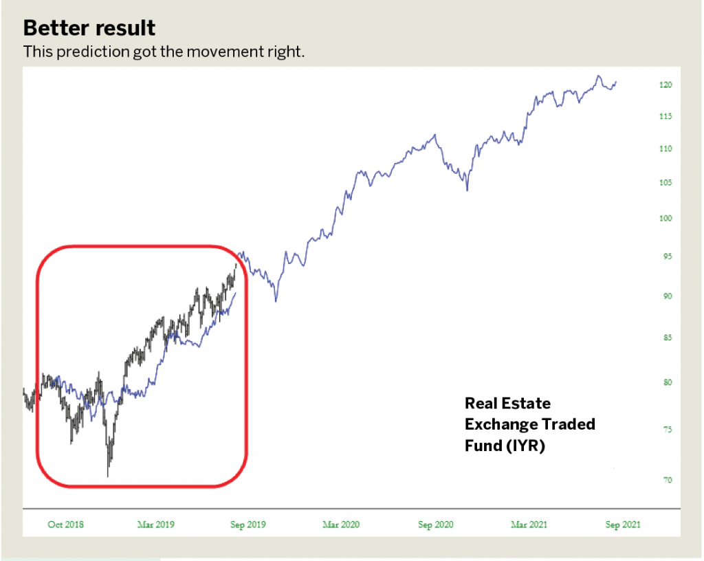
In light of that, it would seem that the optimistic prediction for the next two years of IYR would be worth remembering. The blue line shows clearly seasonal characteristics with notable dips and climbs at certain times of each calendar year. If past predictions indicate the power of present prognostication, the system is suggesting good times ahead for the real estate fund.
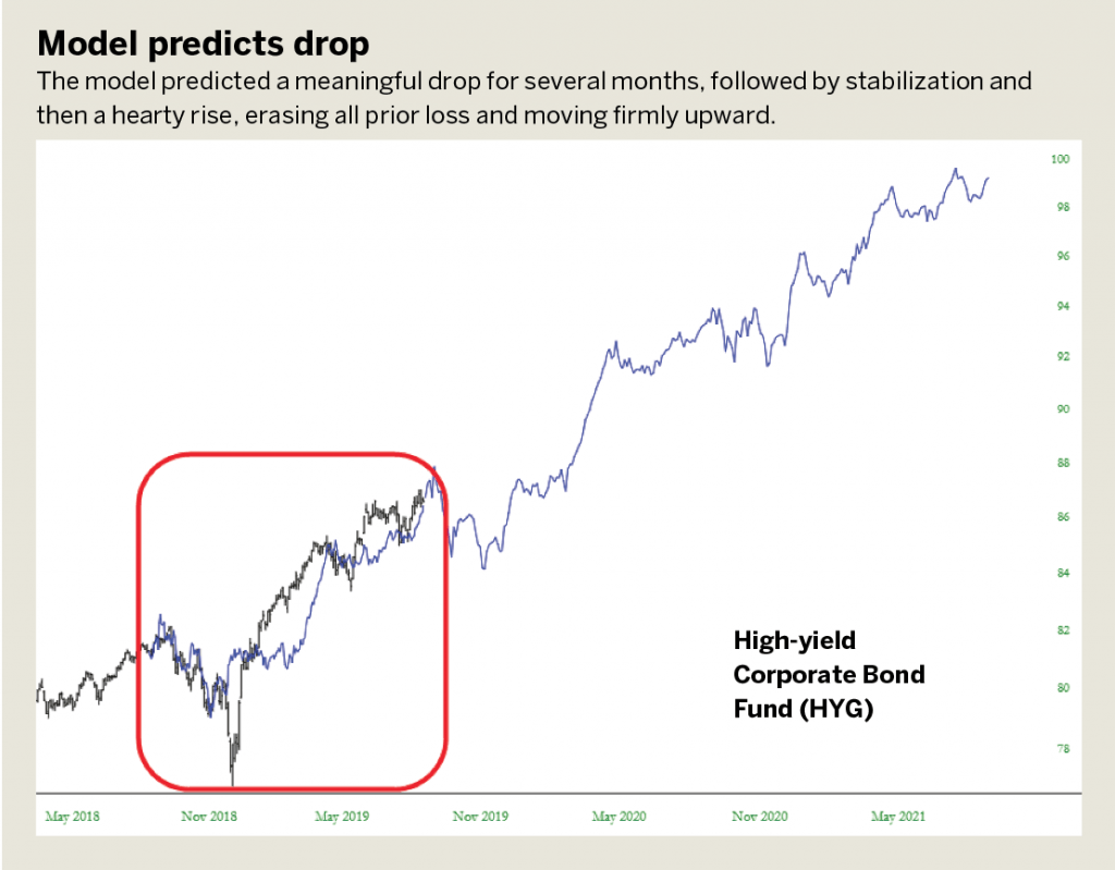
The High-yield Corporate Bond Fund (HYG) provides an even better example. The model predicted a meaningful drop for several months, followed by stabilization and a hearty rise, erasing all the prior loss and moving firmly upward. That is precisely what happened, and after the entire year had passed, the predicted price was virtually identical to what had really taken place. (See “Model predicts drop,” below.)
Amalgamating previous price data and using those movements to predict future prices based merely on seasonality is simplistic and often misleading. Just because a stock has reliably gone up, for example, during June and July every year for the past decade, doesn’t necessarily mean it’s going to do the same next June and July. However, 10 years of similar behavior certainly suggests it’s more likely to happen than not—because, regardless of reason, that’s simply the behavior for an entire decade.
Financial securities are subject to countless forces, both positive and negative. General market conditions, specific events affecting a corporation or commodity, interest rates, commodity prices and the political environment can all tug the price of a security higher or lower, blind to any past seasonal tendencies. However, a subset of securities tend to be more seasonal than the rest and, in those cases, investors can use the predictive nature of such cycles as another tool in the kit.
Some charts prove more “predictable” than others, and it’s enjoyable to experiment with different securities to see how “trend-friendly” they are. Beyond that, observing how trends and seasonality play out can be fascinating.
Tim Knight has been using technical analysis to trade the markets for 30 years. He hosts Trading the Close daily on the tastytrade network and offers free access to his charting platform at slopecharts.com.