Crypto Charts Really Well—Here’s What They Say
Traders have been charting the financial markets for hundreds of years, and by the late 1930s Robert D. Edwards and John McGee established modern methods of analyzing historical price data.
Just about any financial market can be charted, whether it be commodities, equities, mutual funds or cryptocurrencies, but the charts are truly useful only when the market is organic. That’s because the charts depend on an honest and unadulterated expression of supply and demand in a true market of buyers and sellers.
These days, cryptocurrencies embody the “purest” of markets in that they appear most compatible with classic charting methods and thus represent an earnest representation of the balance between buyers and sellers.
As such, some easy-to-follow and simple-to-interpret chart objects can aid in deciding crucial support and resistance levels for any crypto coin. They can also signal when things have taken a wrong turn.
Trendlines
The trendline, the simplest element in charting, is a straight line “anchored” to at least two price points. A well-placed trendline identifies either an uptrend or a downtrend.
A broken trendline indicates the trend has been damaged and might possibly be reversing. Often, the breaching of a trendline changes its “role” from support to resistance (or vice versa).
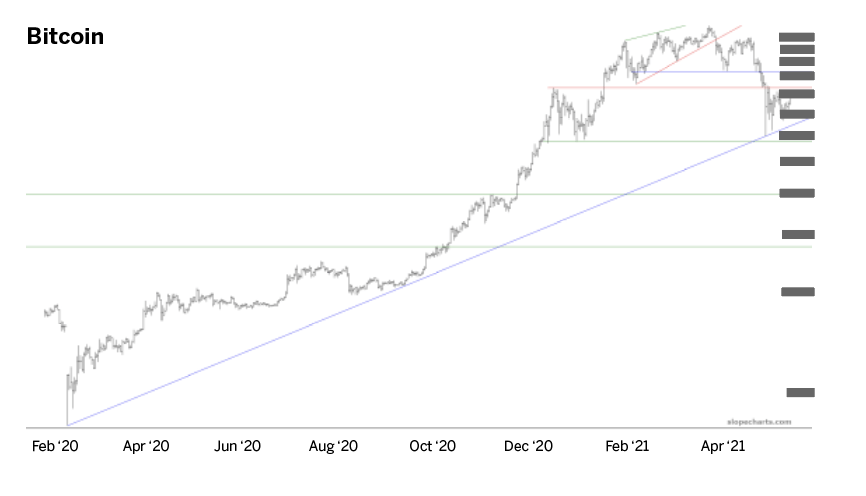
Bitcoin, by far the largest of the cryptos, provides a beautiful example of a useful trendline, even over long time horizons. The long-term trendline was established on March 13, 2020, and about 14 months later, a tremendous sell-off across the entire crypto landscape took even bitcoin down more than 50% from its price peak. However, the trend was not broken.
More important, even during the most severe portion of the sell-off, the price almost perfectly touched the trendline at just under $30,000—representing a potent buying opportunity at a relatively cheap price—and then it reversed powerfully. Ethereum provides an excellent example of the “role reversal.” The coin had been steadily pushing higher, managing to stay above its trendline even during moments of weakness.
However, one day the selling was strong enough to pierce the trendline, and after that, the trendline was still a useful guide to prices, but its purpose had changed. No longer was it a mechanism for support, but instead it became a demarcation of when buying would exhaust itself; in other words, resistance.
Saucers
While trendlines can be either ascending or descending, saucers can be either bottoming or topping. Saucers indicate a time when a market is in an era of uncertainty, and buyers and sellers are struggling to establish a base and a direction.
For example, in the case of a bottoming (or bullish) saucer, prices slowly go lower and lower, but they eventually stabilize and then form a mirror image of what happened before, slowly pushing prices higher and higher.
All along the way, prices do not exceed a certain level. The tension is resolved if and when prices finally push above this resistance level, which completes the saucer pattern and shows that a base has been established.
The Polkadot coin (DOT) provides an example of both a bullish basing pattern and a bearish topping pattern—all in a relatively short time. The green-tinted pattern on the left side of the chart shows how the price took months to establish a base, but once it was completed, DOT went onto a multi-hundred-percent gain in price (see “Polkadot,” below).
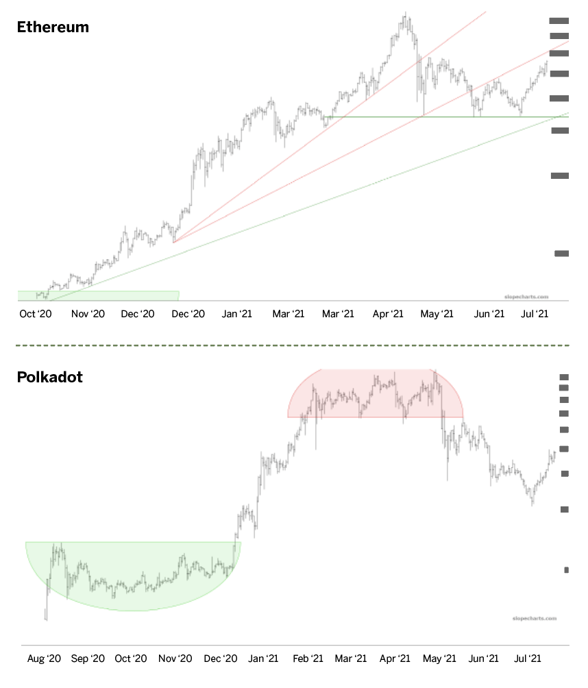
However, as the red-tinted inverted saucer shows, an upside-down version of this same price action indicated that the price was cresting, and once the support of this inverted saucer failed, the coin’s price fell swiftly.
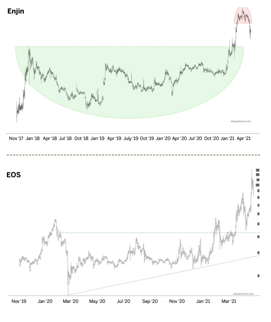
The size of the saucer indicates its strength. Typically, larger saucers are more potent than small ones. Enjin Coin (ENJ) provides an excellent example because its basing pattern is gargantuan compared with the modest topping pattern on the right side of the chart (see “Enjin,” below).
Consequently, the up-move following the bullish base was more powerful than the modest retracement that followed the red-tinted inverted saucer.
Right triangles
A right triangle is simply two lines: one of them a trendline (which, as with all trendlines, can be ascending or descending) and the other a horizontal.
In the case of price strengthening, expect an ascending trendline with a horizontal line above it. For price weakness, look for a descending trendline with a horizontal line below it. Thus, a break above the horizontal is a bullish breakout, whereas a break below the horizontal is a bearish breakdown.
The crypto EOS provides a relatively clean example of such a pattern. Prices were range-bound for well over a year and then finally broke out and formed a multi-hundred-percent gain.
A couple of successful tests of this breakout occurred, meaning that some selling took place, but the prices did not break beneath the horizontal in any significant way. Even after the price peaked and collapsed by an enormous percentage, the price merely “tagged” the horizontal again before bouncing higher.
Thus, the triangle serves a variety of important functions. Before the breakout, it suggests which prices are relatively expensive or cheap, based upon the price’s relationship to the triangle itself.
If and when the breakout ultimately takes place, the pattern takes on its new role as support (or, in the case of a bearish failure, resistance), which will be an important data point for those who have taken a position.
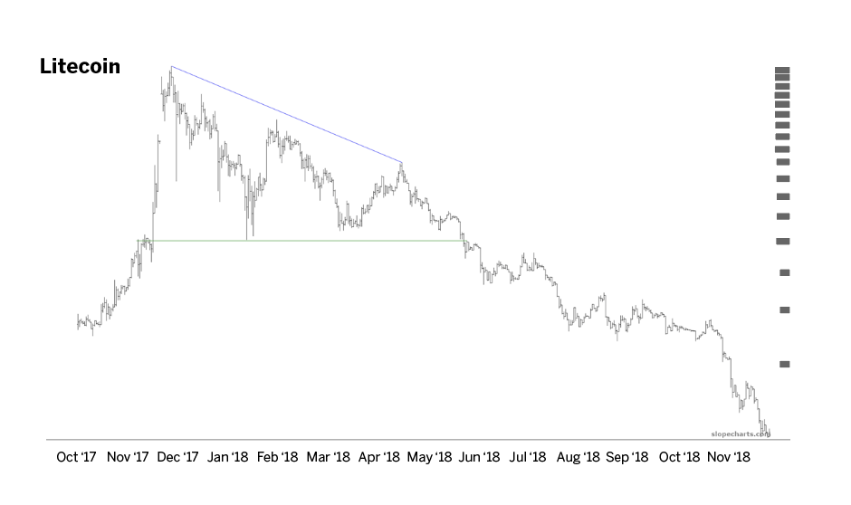
Many of the patterns cited here have been bullish, but Litecoin (LTC) provides an excellent example of a right triangle alerting the trader to a bearish breakdown. This took place during the year 2018.
The price withered away from about $400 to about $100, and the price action was neatly confined by the triangle shape. After the failure of the horizontal, the price kept falling and never looked back. Traders who respected this signal would have saved themselves from serious losses by respecting the failure if they happened to own Litecoin at the time.
Looking ahead
Whether or not cryptocurrencies are going to change the financial world (and, to some degree, the political landscape) remains to be seen. It will probably be years before anyone knows whether or not crypto was a huge fad, a once-in-a-lifetime innovation or something in-between.
But already, here and now, it’s plain to see that crypto represents an excellent trading opportunity. By arming themselves with charts, traders can make better decisions about which coins to trade, when to trade them and what price levels matter. Apply the techniques described here to improve the odds of being a profitable crypto trader.
Tim Knight has been using technical analysis to trade the markets for 30 years. He’s the host of Trading the Close on the tastytrade network and offers free access to his charting platform at slopecharts.com.