Nine Health Stock Trades
Nearly one-fifth of the nation’s economy is dedicated to health care and, at this writing, the sector’s stock prices are caught up in the wild market fluctuations spawned by the rapid spread of the novel coronavirus. So, for a long-range look at the performance of some prominent health-related companies, Luckbox is disregarding recent trends. With that in mind, nine publicly traded firms fall into three categories based on historical performance.
Rock-solid rock stars
The most consistent performers of the group make traders yearn for a time machine because even a relatively modest investment has, over the long haul, grown into a substantial sum.
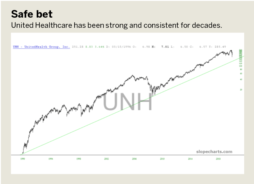
UnitedHealth Group (UNH) has been one of the strongest and most consistent equities in the entire U.S. market for the past several decades. The trendline anchored at the start point of 1990 has never been broken, and even with the strong selling of early 2020, the prices were never even close to threatening a failure of this uptrend. There are times, such as 2008-2010, when the price gave back some prior gains, but those were soon replaced by subsequent gains.
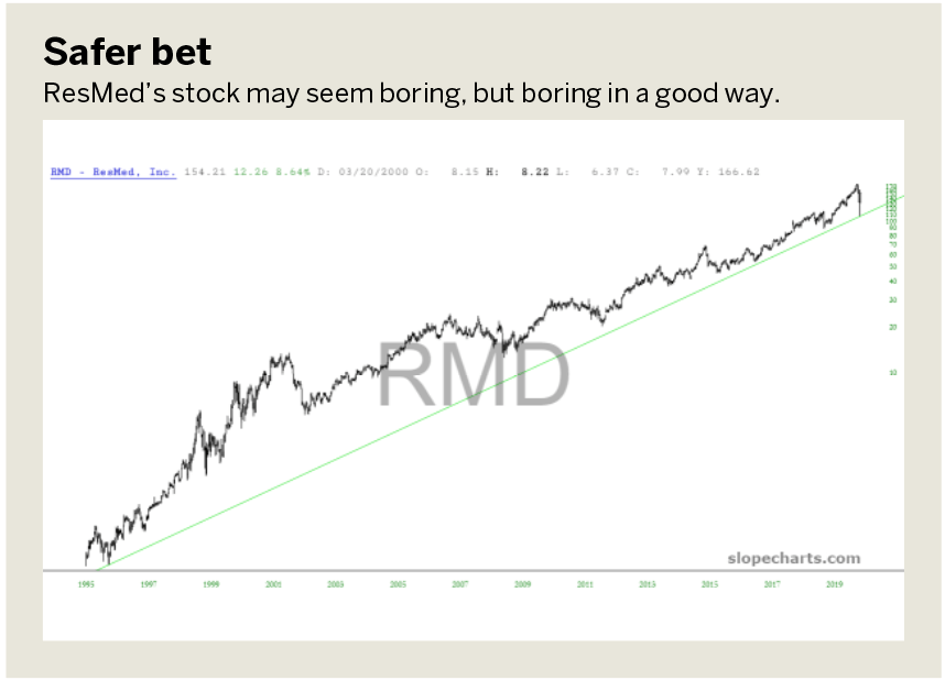
ResMed (RMD) has an incredibly boring chart, but in a good way. This is the kind of “one decision” stock that delights long-term holders because it has increased in price literally thousands of percentage points and also because it has done so without any severe reduction in price along the way. The price trend has been unbroken since 1995, and it seems to be in little danger of breaking in the foreseeable future.
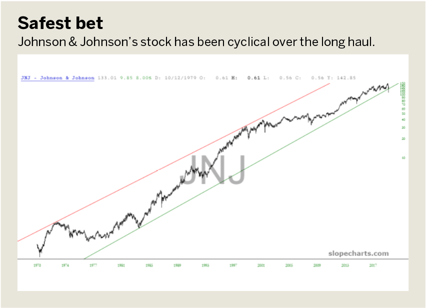
Johnson & Johnson (JNJ) has been a rather cyclic stock over the long haul. Generally, the stock has been in an uptrend for decades, but it has been doing so within the confines of a price channel. From 1973 and 1998, the stock was quite high relative to its channel, but present price levels are relatively low (even though the price itself, in absolute terms, is three times higher). Should this channel remain unbroken, it suggests the stock is at a relatively good price.
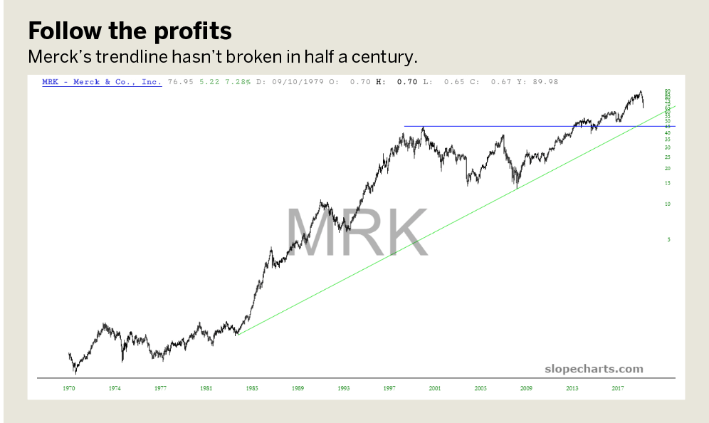
Merck (MRK) common stock has two principal features. First, a trendline that’s been in place since about 1977 and, in spite of multiple bear markets over the past half century, it has never been broken. The other is two lengthy periods of consolidation in price, each followed by a powerful new ascent. The first consolidation occurred between 1973 and 1984; the second was between 2000 and 2015. Since then, the stock increased in price another 100%.
Solid breakouts
The next group features strong performers, but they tend to have periods of consolidation and sink into “the doldrums” before resuming their ascent. Unlike the prior group, which tends to muscle its way higher fairly consistently, these next stocks tend to be either running sideways or pushing higher.
For instance, from 1994 until 2008, Gilead (GILD) was in a steady uptrend, riding along with the strong bull markets of the late 1990s and the years before the financial crisis—even though the bear market of 2000-2002 had little negative effect on the stock.
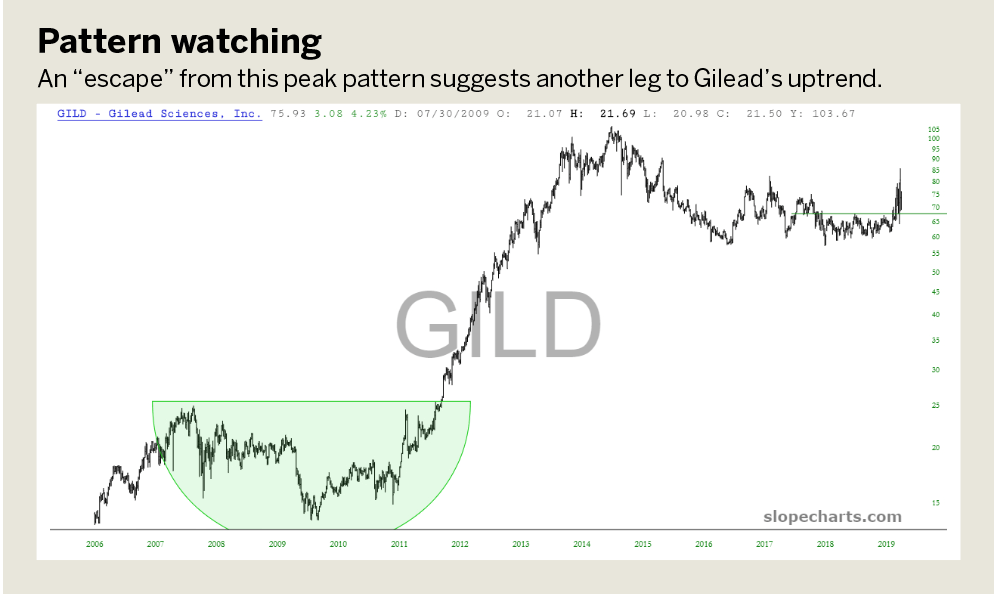
This steady uptrend gave way to formation of a saucer pattern between 2008 and 2012. The drop in the stock’s price from peak to trough was substantial, a value of approximately 50%, but once the saucer was complete the stock quintupled in price.
More recently, a similar saucer, albeit not quite as lengthy, has been in formation. An “escape” from the peak of this saucer would suggest the beginning of another leg to the long-term uptrend of this security.
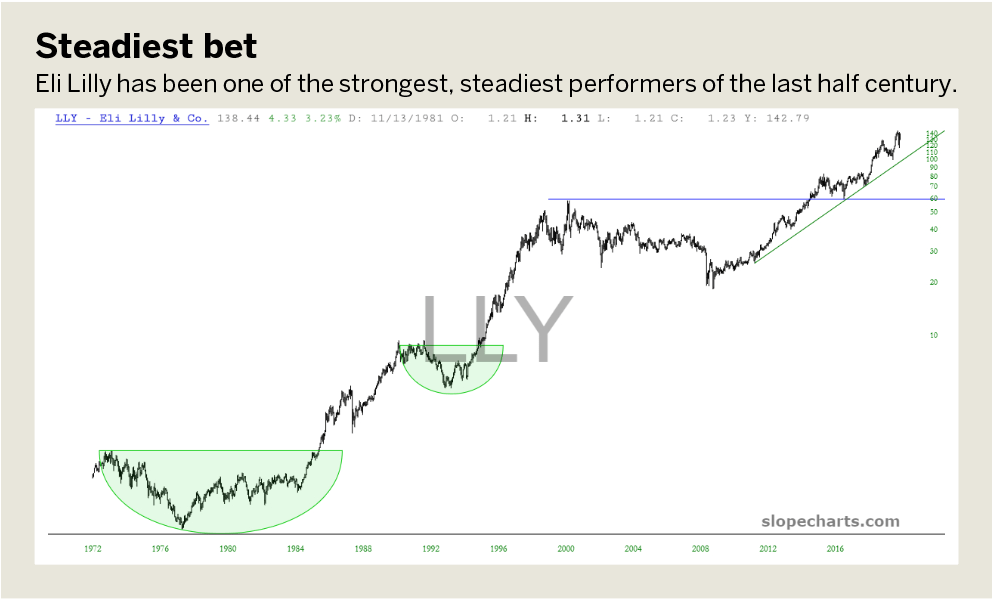
Eli Lilly (LLY) has been one of the strongest, steadiest performers in the market for half a century. Over this long timespan, the stock has formed three massive saucer patterns, each followed by a prolonged ascent in price. The horizontal lines denote the top of each saucer pattern, and the diagonal line shows the steady uptrend that has been in place since the end of the financial crisis.
Sickly breakdowns
These stocks, in spite of periods of impressive performance, are currently looking vulnerable.
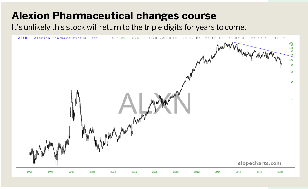
Alexion Pharmaceuticals (ALXN) has a fascinating price history. Its price was erratic between 1998 and 2002, but it became a superbly strong performer from 2002 until 2014, hardly dipping at all in those dozen years. However, in retrospect, it appears that from 2013 to early 2020, a broad range of between $100 and $200 was formed, culminating in a massive reversal pattern. This topping pattern completed in February 2020, and the massive amount of overhead supplies makes it unlikely the stock will return to the triple digits soon.
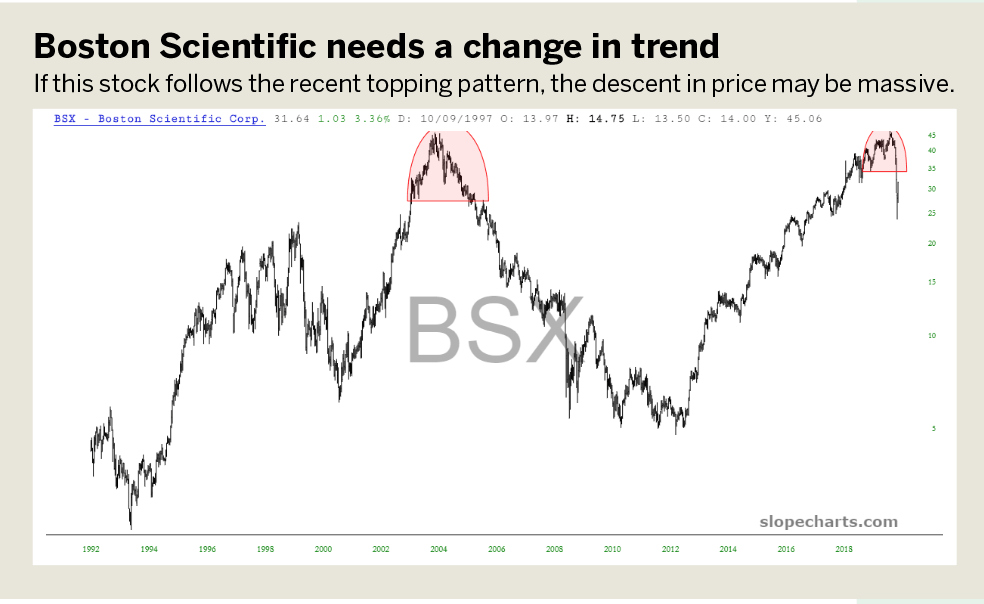
Boston Scientific Corp. (BSX) has had three massive uptrends since the early 1990s and two equally large downtrends. Over the past couple of years, a substantial reversal pattern has formed and completed, similar to the one it sported during the 2007 market peak. If the behavior following the recent topping pattern mimics that of the one 13 years prior, the descent in price may be massive.
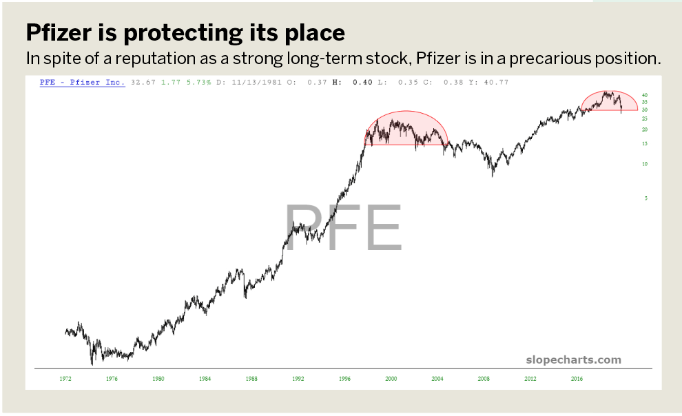
In spite of being a very strong long-term stock, Pfizer (PFE) is in a precarious position at the moment. As illustrated by the reversal pattern from the late 1990s until about 2004, the stock is prone to its own form of bear market, which historically has proven it can shave more than half the price off shares. The ascent from 2009 until 2018 appears to have terminated, giving way to a reversal pattern.
As Luckbox goes to press, the planet is in the throes of the worldwide COVID-19 pandemic, and markets suffered their fastest, most terrible crash in financial history. In spite of this, many of these equities held up astonishingly well, which can be interpreted as a testament to their long-term corporate health.
Tim Knight has been using technical analysis to trade the markets for 30 years. He hosts Trading the Close daily on the tastytrade network and offers free access to his charting platform at slopecharts.com.