Technically Speaking, the Future Does Not Look Very Bright
While the year began with tremendous optimism, record-high stock prices and an extraordinarily positive business environment, much of the economy soon came screeching to a virtual standstill in the face of the pandemic.
The speed and violence of the reversal ravaged the economy in the first quarter. Take, for example, vehicle sales in the United States. The data spans decades, going back to when Gerald Ford was president and General Motors still dominated the world’s auto sales.
Over the years, broad upturns and downturns in sales have roiled the auto industry, but March of 2020 was simply unprecedented. Sales reached some of the highest points of the past 40 years before plunging to the levels of the financial crisis of 2008 almost instantly.
It happened because virtually the entire country was asked to stay home or travel as little as possible. The lack of travel, coupled with the shuttering of auto dealerships, led to the sharp drop, which will surely go lower.
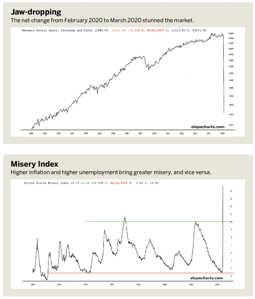
A retail clothing sales chart shows this well. It would be easy to mistake the nearly vertical line at the right edge of the chart for part of the grid, such as the vertical axis. This is the net change from February 2020 to March 2020. Even on a multi-decade chart, it’s a prominent feature. (See “Jaw-dropping,” below.)
Misery loves company
The paradox of economic downturns is that they happen just when they seem least likely. But just as “it’s always darkest just before the dawn,” the converse is also true. Remember the Misery Index (above)—a combination of inflation data and unemployment data—created in the 1960s? It states that combining higher inflation with higher unemployment engenders greater misery and vice versa.
By definition, when cycles are at a nadir (in this instance low unemployment and low inflation), the upturn in those cycles means things are getting worse. In early 2020, the Misery Index was at about 3.5, the lowest level in more than half a century. This chart goes back to World War II, and there was hardly any instance when, based on this indicator, people were less “miserable.” Then came the pandemic.
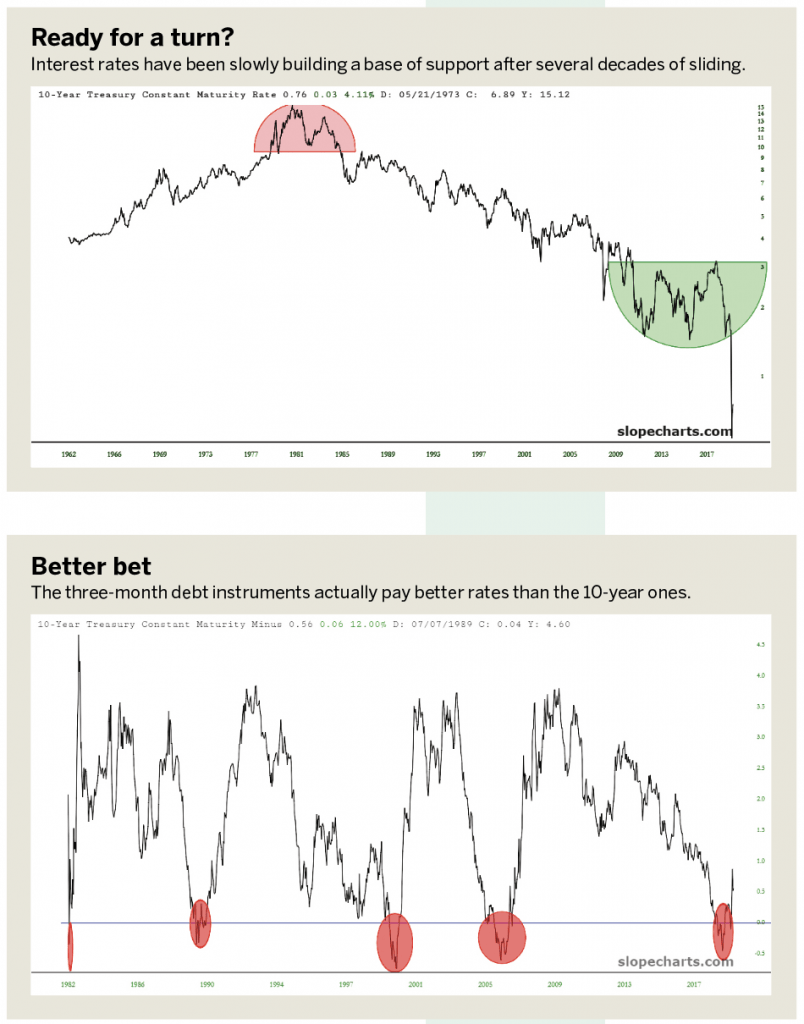
Another powerful pivot point that took place at the same time was in interest rates. As an economy improves, rates tend to slowly increase. As demand for funds increases, lenders can increase the price of money and an economy that’s getting stronger can support the greater debt service.
As the tinted portion of the chart in “Ready for a turn?” (below), shows, interest rates have been slowly building a base of support after several decades of sliding. The rounded bottom pattern seemed to indicate that substantially higher interest rates—and lower bond prices—were coming in 2021 and beyond.
However, the worldwide economic crisis compelled central banks to slash rates to essentially 0%. Thus, as with the auto sales graph, the path of the graph instantly plunged. Although this chart goes back for 60 years, interest rates have never been nearly this low.
The most reliable indicator
Long-term charts not only indicate where a trend might be heading but also provide earlier examples of a given type of behavior and offer insight into what happened next. One especially well-known example of this is the chart of the difference between the 10-year treasury rate and the three-month bill rate. This “spread” chart captures the difference in these interest rates, which in normal economic times is about 3% because longer-term debt instruments paid substantially more interest than shorter-term ones.
However, during times of economic strain, when faith in the future diminishes and fear of the present increases, this spread can collapse and even invert. In other words, three-month debt instruments actually pay better rates than the 10-year ones.
Historically, these instances of “curve inversion” have had a 100% success rate for predicting imminent recessions. With the graph shown here, the tinted areas mark the precursor events of:
- The 1982 recession following massive interest rate hikes;
- The 1990 recession around the Japanese financial crash;
- The 2000 bursting of the internet bubble;
- The 2008 financial crisis;
- The 2020 bursting of the “everything bubble”
In response to this latest recession, the Federal Reserve has taken actions so extraordinary that they make the bailouts of 2009 seem tame. Literally trillions of dollars of fiat money have been conjured out of thin air to combat the economic downturn, and one chart that captures this is the graph of the assets held by the Fed. (See “Fed’s latest assets,” below.)
Six general phases occur from left to right:
- The slow, steady “keep inflation at 2%” accrual before the financial crisis, when the Fed actually had some vague semblance of normality and decency (at least relative to today);
2. The explosive ramp-up to combat the financial crisis;
3. The continuation of asset acquisition, less frenetically than in 2009 but at a vastly sharper pace than before 2008;
4. A leveling out to form a “flat top’ region when the acquisition of new assets stopped;
5. A cautious, measured, carefully planned tapering, ostensibly to get the Fed back to its pre-crisis balance by the year, oh, let’s say 2350;
6. Then the latest freak-out, which exploded the balance from $2 trillion to $6 trillion on the way to $10 trillion this year.
Bear market ahead
From 1982 until 2020, a period of nearly four decades, the public has become extraordinarily accustomed to a never-ending bull market. Although there were brief periods of weakness (1987, 2000 and 2008 in particular), on the whole, stocks have ascended with the support of an endlessly accommodating Federal Reserve and an enthusiastic public. As the chart of the S&P 500 Index illustrates, the overall uptrend has actually been in place since the 1930s, and a “channel” style uptrend was in place from March 2009 until just recently.
The dislocations and damage from this latest economic downturn will probably create a much longer effect than the brief “V-shaped bottom” that politicians are touting. As multi-decade charts illustrate, the sudden changes in all aspects of the economy could create an extraordinary bear market with longevity measured in years, as opposed to weeks.
Tim Knight has been using technical analysis to trade the markets for 30 years. He hosts Trading the Close daily on the tastytrade network and offers free access to his charting platform at slopecharts.com