The Diamond Trade
Deciding whether to "jump the gun"
To technical traders, diamonds are reversal patterns for both bullish and bearish trading opportunities, and the ability to identify one in the midst of a standard price chart takes a bit of an “eye.” It’s a skill that requires knowledge and experience.
A diamond pattern is formed on the left side by a series of higher highs and lower lows and, once past the midpoint, a series of lower highs and higher lows. The security loses its ability to trend (becoming increasingly wide in its range) and then begins tightening its range again, suggesting that it’s losing its moorings. A couple of examples of wellformed diamond patterns show how their measured moves played out.

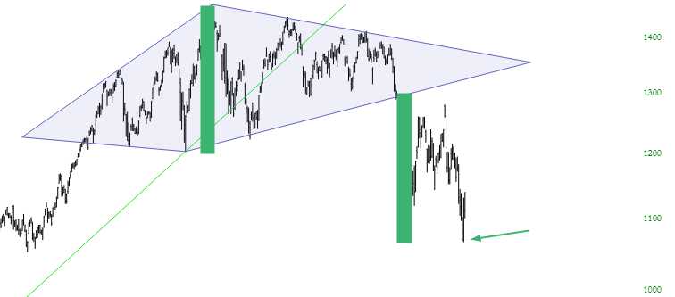
In this example from the S&P 500, the diamond pattern during a period of nearly a year is drawn on top of the price chart for the sake of clarity. The range from the top to the bottom of the diamond pattern has been drawn with a simple shaded rectangle.
First up comes the S&P 500 cash index from late 2010 and early 2011. The stock market was in a general uptrend, peaking on the S&P 500 at around 1350. Then it started to subtly trend lower. The diamond pattern during the period of nearly a year has been drawn on top of the price chart for clarity. The range from the top to the bottom of the diamond has been drawn with a shaded rectangle.
Measuring the price movement potential of a diamond requires calculating the spread between its highest and lowest points and then adding that value to the price point where it breaks outside the diamond. Thus, if a diamond spans from $60 to $70 and breaks down at $65, then a trader can target $55 for the price movement downward. In this example, the peak occurs at about 1370, and the bottom of the diamond comes at about 1230, which means the spread is 140 points.
The price broke beneath the diamond on Aug. 1, 2011, when the Index was at about 1290. Subtracting 140 from 1290 yields the price target of 1150, which was swiftly achieved by Aug. 9. The index went as low as 1074 in early October before it resumed its climb. The market dropped so quickly because of a U.S. Treasury debt crisis. The diamond not only highlighted an excellent trading opportunity but did so with remarkable swiftness.
Another example is equally useful. The chart “Long time in the making” (below) shows the semiconductor index, referenced on most charting platforms with the symbol $SOX. This diamond spans about a year, from September 2017 to October 2018. The spread is illustrated with a solid rectangle, and the same-sized rectangle is shown from the “failure” point. Based on that calculation, a target price of a little under 1100 was offered, and the target was achieved by December 2018. It wasn’t as quick as the S&P 500 movement from 2011, but it provided an excellent opportunity nonetheless.
This diamond spans a period of about a year, from September 2017 to October 2018. The spread is illustrated with a solid rectangle, and the same-sized rectangle is shown form the “failure” point
For diamond tops, volume usually increases during the formation of the pattern, largely because the “churn” increases as bulls and bears struggle over the direction of the stock. One benefit of a diamond, as opposed to a head-and-shoulders pattern (of either variety), is that the signal tends to come earlier. That’s because of simple geometry: a price will break below an ascending line (or above a descending line, as the case may be) much sooner than a horizontal line, so the amount of move that one can “capture” is that much larger.
To be clear, diamond patterns are not strictly for shorting opportunities; instead, they are reversal patterns, which means they can be just as potent at spotting bottoms as they are at spotting tops. Given the market’s nearly decade-long ascent, however, these examples are focused on topping patterns. But the rules of measuring the targets are nearly identical. The only difference is that instead of calculating from the “breakdown” point (when the price breaks below the lower-right line segment of the diamond), it is instead calculated from the “breakout” point (in which the price breaks above the upper-right line segment).
As of this writing, the example was nowhere near fulfilling its price target. Only time will tell if it ultimately does.
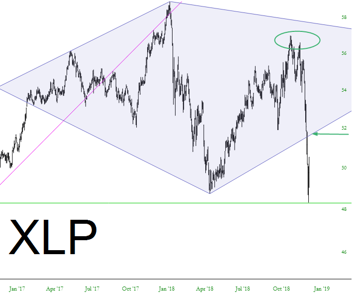
As of this writing, the final example was nowhere near fulfilling its price target. Only time will tell if it ultimately does. The opportunity in question is the Consumer Staples Select Sect. SPDR ETF (XLP). Here’s an examination of the pattern piece by piece.
- It begins in February 2017.
- Then the price ascends until January 2018 at a value of about $59.
- The price descends until May 2018 at a value of about $49 (thus a spread of $10).
- A price failure took place on Dec. 18, 2018 at about $53.
- The price target, therefore, is $43 — a descent of 20% from the failure.
Traders can use these patterns to make the tactical decision on whether to “jump the gun.” In the XLP graph above, part of the pattern is circled where the profit opportunity is greater, but likewise so is the risk. In other words, if a trader anticipates that the pattern will, in fact, complete itself, it makes more sense to short XLP at the area circled (about $57) instead of waiting until the “official” price failure $4 beneath.
The risk is that the pattern will never complete. A trader might short it at $57 and watch the price go zipping higher, thus ruining the pattern. A 90% complete pattern is not, after all, a complete pattern but merely one in formation. Deciding whether or not to take advantage of a trading opportunity on either the long or the short side before the pattern itself is complete, regardless of the pattern type, is a choice only an individual trader can make. Strictly speaking, traders should wait until the pattern is finished.
With this example, the pattern has, in fact, completed, so the price target is illustrated in the chart below. Assuming this diamond pattern plays out, this was another successful estimate of a target price based on a simple calculation.
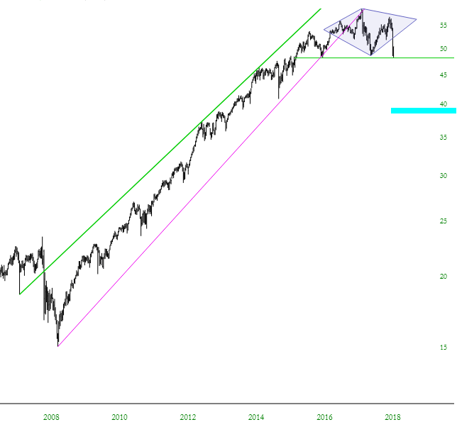
Assuming this diamond pattern plays out, the price target tinted below is the eventual target.
The key to diamonds is being able to spot them. Traders who believe a diamond is forming can carefully circumscribe the price bars with either a quartet of trendlines or, better yet, a polygon tool. Don’t “cheat” by allowing price bars to pierce the pattern. Instead, the entirety of the price action should be contained within the pattern as it’s drawn. If not, take a pass on it and wait for a cleaner opportunity.
Tim Knight has been using technical analysis to trade the markets for 30 years. He founded Prophet Financial Systems and offers free access to his charting platform at slopecharts.com.