The Simple Clarity of Trendlines
A veteran trader tackles technicals
Technicians draw basic but powerful trendlines on charts to help them understand areas of support, resistance and change. In financial graphs, trendlines can provide perspective on likely price behavior, usually by emphasizing important price levels. They’re the most basic charting tool, but a solid knowledge of using and interpreting them can prove essential to success as a technical analyst.
The artfulness is in discerning when to redraw or reposition a trendline.
Here are some properties of a well-drawn trendline:
- During the time it’s intact, the trendline connects at least two points of a graph (with high points or low points), and the more points it touches (without the price bars going above or below the line), the more valid and useful the line.
- It is, during that time, never violated by prices between the starting and ending points; in other words, all of the prices fall either below the trendline (in which case the line is resistance) or above the trendline (in which case the line is support).
A trendline’s purpose depends on the user’s relationship with a particular security. If an investor has a position in a stock, the trendline ensures that the trend of the stock is intact so that when the trend is violated the investor can exit the position as profitably as possible. If an investor doesn’t have a position in the stock, the purpose of a trendline is to show when a possible trend change has taken place so that the observer can consider taking a position in the stock based on that trend change. (The term “stock” is used broadly here and can refer to any financial instrument or its derivative).
Drawing a trendline seems simple because laying down a straight line to “bound” the uptrend or downtrend of a stock makes intuitive sense. The artfulness, however, is in discerning when to redraw or reposition a trendline. As a stock moves, it may become appropriate to redraw a trendline to take into account the more complete price data. The danger is that and investor can wind up fooling himself. If trendlines become so elastic that they bend and move no matter what direction prices are heading, then their value is eliminated.
The trendlines of two major entertainment stocks can provide some insight. One’s bullish, and another bearish.
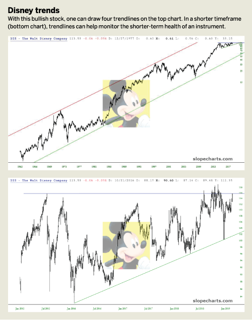
Starting with the bullish stock, Disney (DIS), a technician can draw four trendlines on top of it. See “Disney trends,” right.
The green and red trendlines constitute an ascending channel. Separately, each is a trendline in its own right. But taken together, because they’re parallel, they are a price channel bounding the daily bars for many years of the stock’s price. As long as the price doesn’t break beneath the lower trendline, this uptrend can be considered solidly intact.
A closer look at the recent history of DIS illustrates how, in a shorter timeframe, trendlines can help to monitor the shorter-term health of an instrument.
The lower line, in green, is the supporting trendline, and just as with the much longer-term trendline, it has never been violated. The horizontal line, in blue, constitutes resistance as of this writing. If and when it manages to push above this blue horizontal, the role of that line will change from resistance to support. These simple lines help affirm the underlying support of the stock and its potential for further price gains, should it break above its resistance level.
The notion of “violating” a trendline is important. A treadle provides a line that prices should stay above (if the line is support) or below (if resistance). If prices stray across the trendline, something has changed. Deviating from the lines doesn’t necessarily signal a change, but the trader better start paying closer attention.
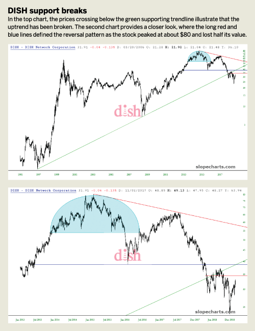
In the case of the DISH Network (DISH), price has definitely crossed under the green supporting trendline. The uptrend has, by definition, been broken. (See “Dish support breaks,” right.)
A closer examination of the chart shows the breakdown in more detail. The long red and blue lines defined the reversal pattern as the stock peaked at about $80 and lost half its value. In spite of that tremendous loss, the actual uptrend failure hadn’t occurred yet.
That took place only when the price broke beneath the green trendline. Notice how, once prices have violated the trendline they tried to go above it again but are repeatedly repelled. That illustrates the “role change” that has occurred.
Just because the trendline is broken doesn’t mean a financial instrument is headed for a major change, but it often means that the chart is no longer in the defined uptrend. Paradoxically, stocks that break their uptrends can still move higher in price, and stocks that break downtrends can still move lower. A violated trendline, however, is one of the simplest warning signals investors can monitor.
The old saying, “the trend is your friend” has been true ever since charts were invented. In spite of how sophisticated some technical indicators have become, the most minimal of studies — a simple, straight line — can be the most faithful ally.
Tim Knight has been using technical analysis to trade the markets for 30 years. He founded Prophet Financial Systems and offers free access to his charting platform at slopecharts.com.