Trading the Trading Posts
Twenty years ago, the idea of publicly traded stock and commodities exchanges would have struck most investors as extremely peculiar. It might have seemed almost “meta” because exchanges were places where buyers and sellers convened to make markets. The notion of the markets themselves becoming tradeable took a certain leap of imagination. In spite of that, a variety of exchanges have indeed become public, and their success as financial instruments has been spectacular.
These days, the public exchanges are quite richly valued. Three of them post price-to-earnings ratios (P/E) at levels formerly reserved for high-tech companies and breakout biotech ventures. The CME Group (CME) has a P/E of about 19, the Intercontinental Exchange (ICE) has a P/E of about 27, and Nasdaq (NDAQ) has a sky-high 36 P/E.
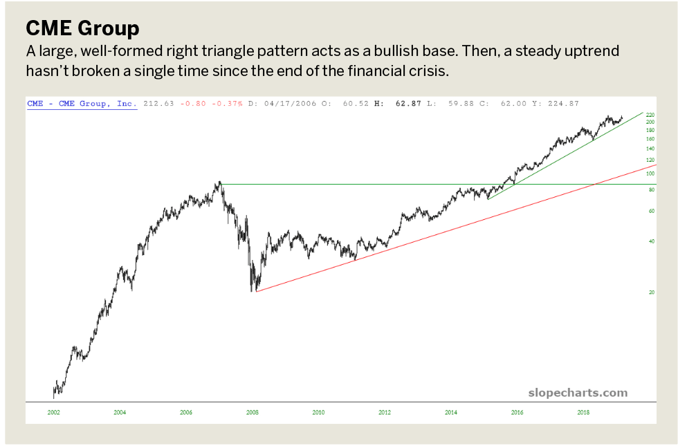
Although these valuations vary widely, the core business of each firm is information and market-making. Graphs of the three exchanges’ stocks look remarkably similar, and the CME Group chart illustrates two consistent properties of all three stocks. First, a large, well-formed right triangle pattern acts as a bullish base. Second, a steady uptrend hasn’t broken a single time since the end of the financial crisis.
Comparing the trio
Although the general shape and success of each of the three exchanges have much in common, the differences become more stark when the stocks are compared in percentage terms. Although each of the stocks has performed well since 2008, the standout, by far, is the Intercontinental Exchange. It has done three-fold better than the CME Group and almost five-fold better than Nasdaq.
As the CME Group illustrates (below), all three stocks were hit hard during the financial crisis, which was understandable considering the business they are in. The CME Group fell particularly hard in 2008, probably because of the tremendous collapse in commodities during the financial crisis.
The chart called “Comparison,” ((below), shows the three stocks in percentage terms, with the Intercontinental Exchange in black (the best performer, on top), the CME Group in blue (the middle performer), and Nasdaq in green (the laggard, bottom).
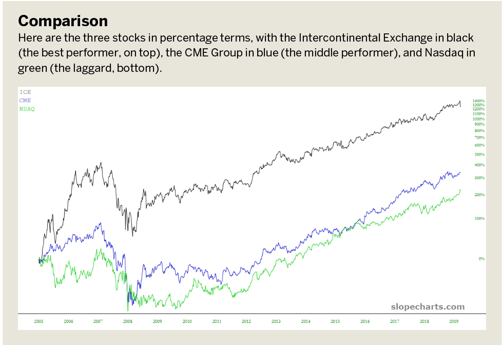
In all three cases, the stocks hit lifetime lows at the end of the financial crisis and then began ascending with virtually no pauses. It stands out that even though the Intercontinental Exchange fell like the others, it had already appreciated handsomely. That meant over the long term that its intact gains were far more significant than those of its competitors.
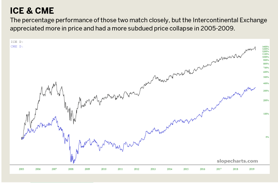
Nasdaq differs from the CME Group and the Intercontinental Exchange because it’s a stock exchange, and the other two are commodities exchanges. It’s thus unsurprising that the CME Group and the Intercontinental Exchange have more in common with their performances. They’re in virtually the same business of providing a market for both physical and financial futures products, as well as related businesses such as market data.
The percentage performance of those two match closely but, again, the Intercontinental Exchange appreciated more in price and had a more subdued price collapse in 2005-2009. So over the long haul, it has been a stronger performer. (See “ICE & CME,” below.)
Exchanges and products
While using comparison graphs to examine exchanges, it might be interesting to see what correlation exists between an exchange and its underlying product.
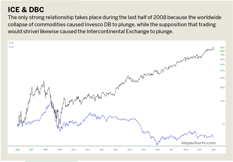
For example, because the Intercontinental Exchange is in the business of providing a marketplace for commodities, let’s examine the relationship the exchange has with a basket of commodities. That’s accomplished by comparing it with the Invesco DB Commodity Index Fund (DBC), which is the exchange-traded fund (ETF) for a variety of commodities. The only strong relationship takes place during the last half of 2008 because the worldwide collapse of commodities caused DBC to plunge, while the supposition that trading would shrivel likewise caused the Intercontinental Exchange to plunge.
Once the crisis ended, however, the two went their separate ways. DBC ambled along aimlessly between 2009 and 2014 before slumping to a new, lower plateau. the Intercontinental Exchange, on the other hand, steadily moved over and octupled in price. (See “ICE & DBC,” below.)
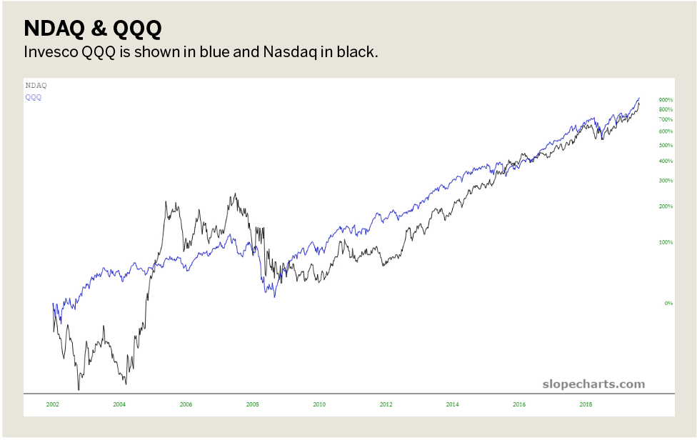
A far tighter correlation exists between Nasdaq and a representative of equities in the form of Invesco QQQ Trust Series 1 (QQQ), the Nasdaq 100 ETF. From 2002 to 2009, those two diverged wildly. (See “NDAQ & QQQ,” below.) From early 2009, however, they moved virtually in lockstep, suggesting that the appreciation in equity prices was assumed to benefit interest in trading equities.
Breaking down the dates
Perhaps the most interesting examination comes from a date analysis. The data in the Intercontinental Exchange, used as a proxy for all three instruments, shows some interesting date-based features of the stock. (See “Date analysis,” below.)
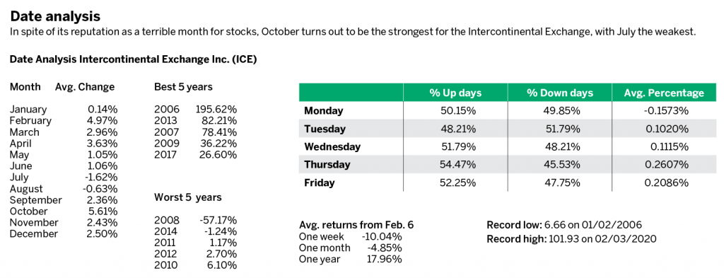
Here are a few standouts:
- In spite of its reputation as a terrible month for stocks, October turns out to be the strongest for the Intercontinental Exchange, with July the weakest;
2. The best year was 2006, with a nearly 200% gain. The worst was, not surprisingly, 2008, when the financial crisis struck and the stock dropped by more than 57%;
3. Days of the week seem to differ meaningfully, with Thursday substantially stronger than Tuesday.
One fact seems beyond dispute: Stocks based on exchanges—whether futures or equities—are at the mercy of asset markets as a whole. Although nearly a dozen years have passed since the last meaningful bear market, investors can rest assured that if and when it happens again, stocks such as Nasdaq, the CME Group and the Intercontinental Exchange will bear the full brunt of the selling, just as they have enjoyed the strength of the lift in assets since early 2009.
Tim Knight has been using technical analysis to trade the markets for 30 years. He hosts Trading the Close daily on the tastytrade network and offers free access to his charting platform at slopecharts.com.