Dark Days Ahead?
Technical analysis of stock prices indicates the markets’ “everything bubble” may burst in 2022
Unhelpful pundits often make technical analysis seem terribly complicated. But the basic tenets of good charting focus on supply, demand, support, resistance and trend lines. Using a limited palette of tools, a skilled chartist can glean great insight from long-term charts about possible directions and their likelihood.
One interesting twist to the world of charting is using those tools and techniques on ratio charts instead of standard charts. Traders can distinguish between a standard chart and a ratio chart by the number symbols used to construct it.
Any given financial instrument can be divided by another. The resulting chart might be interesting, but it might not be useful. For example, one could divide the price history of Apple on a daily basis for the past 40 years by the price data for wheat over the same timespan. But as unrelated as those two things are, the resulting chart would likely be pointless.
There are, however, ample opportunities to create ratio charts from instruments that have powerful, long-term relationships. Let’s examine a variety of such charts and determine what they suggest for the year ahead.
The money supply
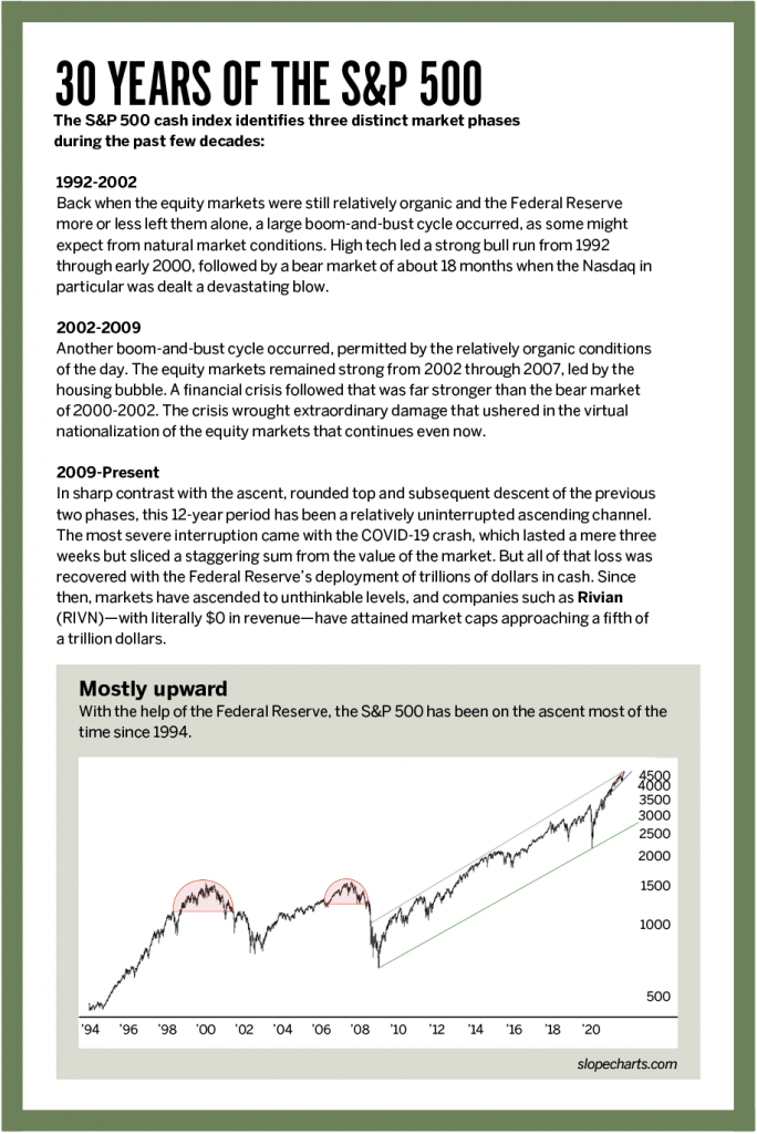
The S&P 500 did not ascend in a financial vacuum. Instead, stocks increased in price in recent years thanks to a tidal wave of liquidity provided by an endlessly accommodating Federal Reserve. Thus, traders could create an honest picture of the performance of the S&P 500 by simply dividing the value of the daily data of the S&P 500 cash by the level of the M2 money supply, as reported by the Federal Reserve. The resulting chart is called “Mostly upward,” in the sidebar at the end of this article.
“A down period,” below, goes back farther in time than the first. The second chart begins in the 1950s and breaks down into some broad component parts:
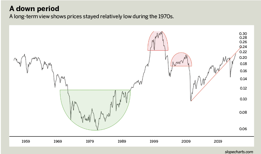
Phase One: This is the steady descent of equity markets through the 1960s and 1970s. Even though the nominal value of the S&P didn’t take on the appearance of a quarter-century bear market, in reality, that’s what was happening beneath the surface—if one measures the stock market through the lens of the money supply. This relentless grind lower ended in the middle of 1982.
Phase Two: This was when the last long-term organic bull market took place, and it was gargantuan. From 1982 until early 2000, the stock market roared higher. The fact that the M2 money supply was changing through this period is taken into account by virtue of the fact this is a ratio chart, and the M2’s growth didn’t hinder the genuine strength of stocks. The green basing pattern that straddles these first two phases illustrates the clarity, longevity and cleanness of the bullish base that formed and launched stocks into their greatest bull market of the century.
Phase Three: Here we have the reversal pattern that preceded the 2000-2002 bear market.
Phase Four: From 2002 through 2007, the market recovered, but take note of how weak the recovery was when the M2 money supply is taken into account. Although the nominal indexes were making new highs, the truth beneath the surface is that this was a flimsy rally propped up by growth in the money supply, and the facade all came crashing down with the great financial crisis.
Phase Five: Finally there was the steady lift in equities from 2009 to date. What’s remarkable about this phase is that even though stock indexes are much higher than ever before (the Nasdaq, for example, soaring well over 200% above its year 2000 high), the M2-normalized data shows that the true strength of the stock market is well shy of the glory days of the 2000 top. In addition, the COVID-19 crash pushed this line chart beneath its ascending trend line, and the strength that followed (based on more trillions from the Fed in 2020) served only to push the line back up to the now-broken uptrend.
In a sense, this ratio chart illustrates how phony the market’s nominal highs have been for the past couple of decades. The true organic peak of the bull market occurred at the turn of the millennium.
Interest rates
Interest rates clearly have an enormous effect on the economy, influencing different sectors of the market in different ways. Higher interest rates tend to discourage consumers from buying real estate, but they help banks prosper. For lower interest rates, the converse is true. Generally, interest rates peaked in the early 1980s and steadily fell for decades after that. In 1981, no one would have believed that the 30-year mortgage rate would be 2.5% in 2020.
The next chart, “Interest rates,” below, illustrates the value of the S&P 500 divided by the 10-year interest rate and shows the relationship between those two components. It yields a fascinating chart. For a full half-century, the ratio chart was steadfastly bound by a price channel. That’s interesting with not just the defining trend lines but with the midline as well. The one exception to that “bounding” of the data took place during the pandemic, when interest rates were battered so long and stocks went so high that the ratio actually escaped the ancient boundaries of that channel. It has since re-entered its familiar path, yet is still in the upper half of the channel pattern, indicating the risk of lower stock prices ahead.
Overvalued technology
Of all the sectors that have increased in value since the pandemic stimulus began, none has benefited as much as technology. Semiconductors, electric vehicles, personal electronics manufacturers and internet sites have seen their stocks appreciate by hundreds or even thousands of percentage points in a matter of months.
An objective way to view this sector, which is historically overvalued, is by way of the RYT/IEF chart in “Tech stocks,” below. The RYT is an ETF dedicated to the technology sector, and the IEF is an instrument that represents yield. In a way, this is similar to the previous chart, except it focuses specifically on technology stocks.
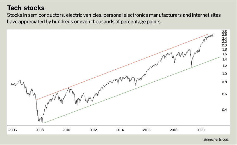
There is a channel in this instance as well, although it extends back to 2008 (as opposed to 1973). Nonetheless, the channel is well-defined and provides an excellent “quick take” as to the relative value of this sector over the long haul. It illustrates how in 2012, 2015 and early 2019, tech stocks were relatively cheap, whereas the data in late 2021 shows this sector to be at its maximum potential (assuming the ratio chart stays confined within the pattern).
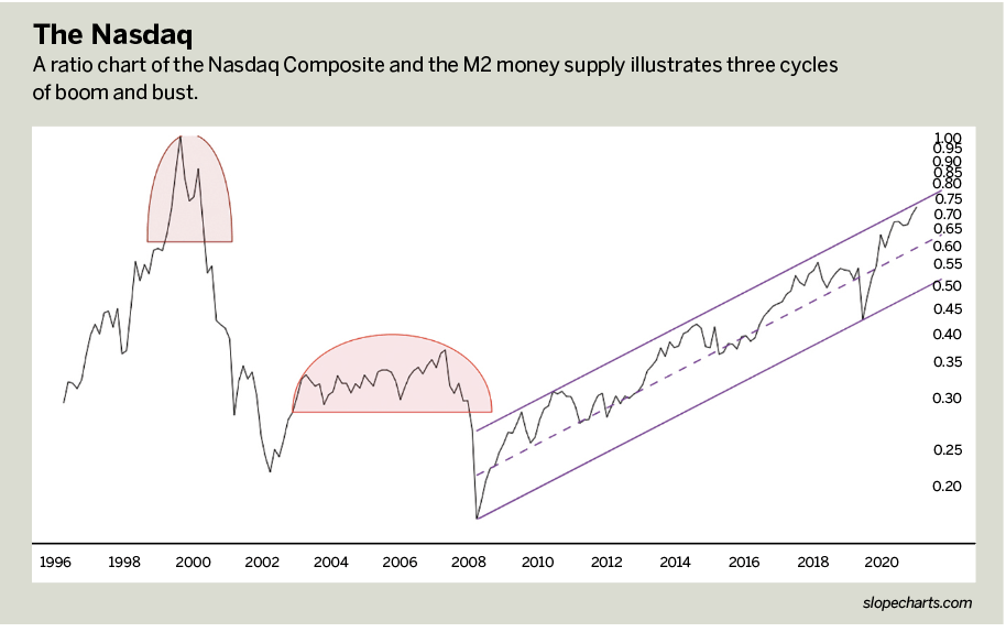
If more evidence is needed, the chart, “The Nasdaq,” below, divides the Nasdaq Composite by the M2 money supply. The rationale, again, is to view the more honest valuation of this index through the lens of a changing money supply. This chart goes back quite a bit farther, all the way to 1996, and shows three major events. First came the boom and bust of the internet bubble; second, the boom and bust of the housing bubble; and third, the boom (and yet-to-bust) ascending channel of the “everything bubble.” Even if this channel continues to rise until the end of time, as surely the Fed would desire, present price levels show that the tech sector is by no means bargain-priced.
The risk of small caps
The charts clearly suggest that the stock market is richly valued, with the tech sector “fully valued,” to put it politely. Traders might consider one last ratio chart that doesn’t compare a stock index or ETF to an outside economic data set but instead directly compares one index to another.
See: “Small-cap woes,” below.
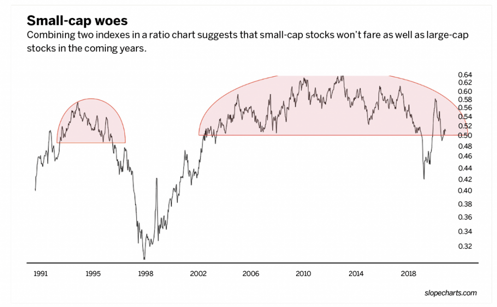
Specifically, it divides the price data of the Russell 2000 small-cap index by the much more highly valued S&P 500 stock set. If history serves as any guide (specifically, the small tinted dome on the left side of the chart), it seems logical to believe the years to come will be much worse for small-cap stocks than large-cap stocks because this is an enormous “rounded top” pattern. If the value of this contrived chart falls, it means, at a minimum, that the ascent of the S&P 500 will be much heartier than that of the Russell 2000 or, more likely, that the Russell 2000 will fall more swiftly than the S&P 500. Both produce the same outcome.
It’s fascinating to examine combinations by way of classic charting techniques. What these simple combinations seem to suggest clearly for the year 2022 is that stocks could be in serious trouble. Their descent could create a particularly acrimonious political landscape for the midterm elections.
Tim Knight has been using technical analysis to trade the markets for 30 years. He’s the host of Trading Charts with Tim Knight on the tastytrade network and offers free access to his charting platform at slopecharts.com.
@slopeofhope